Are You Making these Mistakes with Your Window Display?
 A well-designed window display will have a positive impact on your store’s traffic, and subsequently, its sales. It will catch shoppers’ attention, encouraging them to walk into your store and check out the advertised product. However, the wrong window display will have the opposite effect by discouraging shoppers to enter your store.
It Doesn’t Connect with Your Target Audience
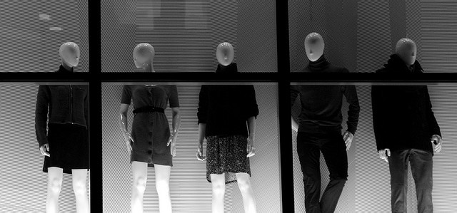
When designing a window display, consider your target audience and whether or not they can relate to the elements being displayed. If you operate a store that sells women’s apparel, for instance, you should stick with female mannequins in your window displays. On the other hand, if your store sells sporting goods products, you may want to use male mannequins that are dressed and positioned in sports poses. Following this simple rule will go a long ways in enhancing your window displays.
Too Much Blank Space
While there’s rule stating that you must use every available square inch of space in your store’s window display, leaving too much empty space creates a bland appearance that will ultimately hurt your efforts to attract new customers. If there’s open space in your window display, consider filling it with props or decorations. You don’t have to necessarily fill empty spaces with products, but rather include props to enhance the display and make it more attractive.
Inadequate Lighting
Don’t underestimate the importance of lighting in your window displays. Lighting will illuminate your display, enhancing the advertised products for a greater level of visibility. Rather than using just standard overhead lighting, however, you should consider using track lighting. With track lighting, you can adjust the fixtures to focus on specific products or elements of your display.
It’s Disorganized
A good window display should be clean and well-organized. If there’s random props and debris scattered throughout, it may have a negative impact on shoppers. Therefore, you should put forth the effort to clean and organize your window displays.
No Central Theme
Want to know the secret to designing an effective window display? It’s the theme. If you check out some of the window displays designed by the biggest national retailers, you’ll probably notice that they all have a central theme. Sometimes the theme is obvious, while other times its more subjective. Build your window display around a basic theme that reflects the advertised products for maximum effectiveness.
If you have any questions at all about visual merchandising, please give us a call at 800.241.6897 or email us at /contact-us/.


